Case study
Chargex: redesigning a lithium battery datasheet, before and after
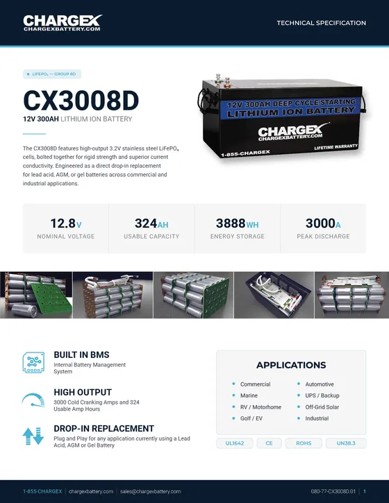
Chargex was moving to a new navy and cyan brand. Their CX3008D battery datasheet had every spec a buyer needed, but the layout made them work to find it. I rebuilt it in the new brand without dropping a single spec.
- Lithium batteries
- United States
- 2-page datasheet redesign
The brief
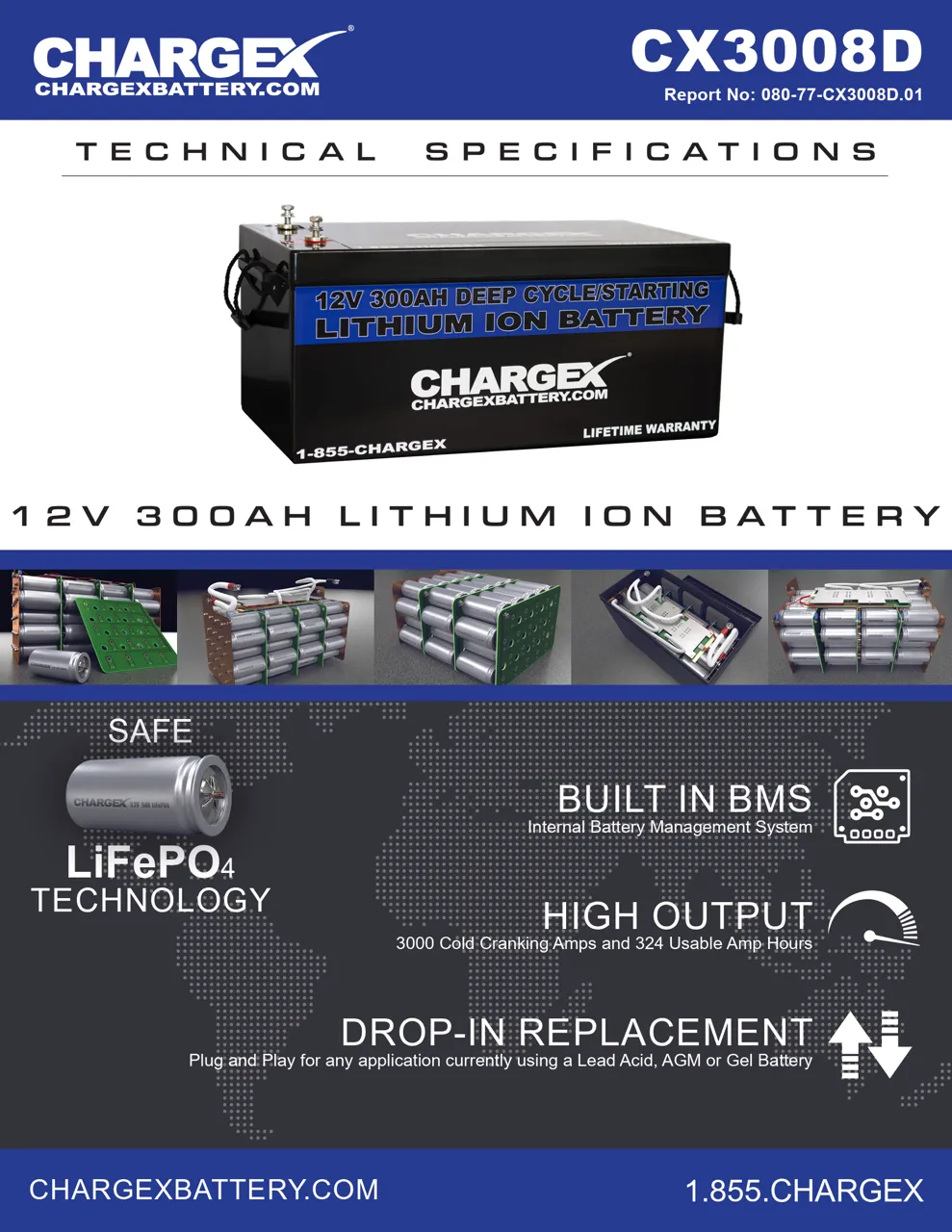
The old datasheet relied on heavy blue blocks, letter-spaced headings and marketing claims set at the same size as technical data. Nothing on the page told the reader where to look first.
Before and after
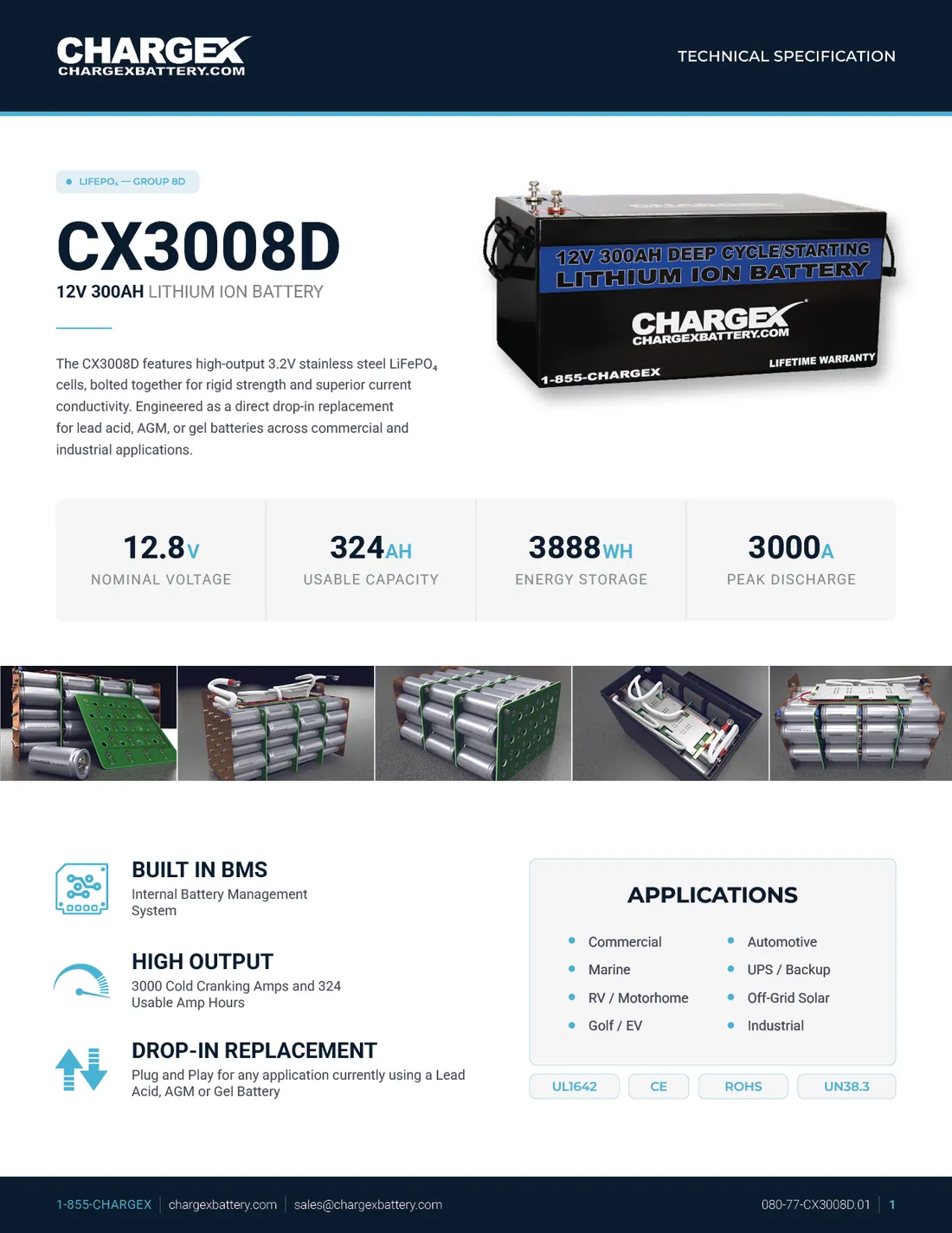
On the left, the original first page. On the right, the redesign. Same product, same facts, a very different reading experience.
What changed
- Model first. The model number and a one-line description now lead the page, followed by a short paragraph on what the battery is for.
- Four numbers up front. Nominal voltage, usable capacity, energy storage and peak discharge sit in a single strip where every buyer looks first.
- Features with icons. The three selling points (built-in BMS, high output, drop-in replacement) each get an icon and two lines, instead of competing slogans.
- Applications and certifications. A clear box lists where the battery is used, and the certifications sit as small badges underneath.
- New brand, used with restraint. Navy carries the structure; cyan is used only where the eye should go.